Why I Built Fourank: Exploring a Different Approach to Dating Apps
I spent the summer of 2025 building a dating app. Not because I thought I could compete with Tinder, Bumble or Hinge. But because I wanted to explore whether there was a fundamentally different way to approach the problem of helping people meet.
The dating app space is crowded. More than crowded, actually. It feels homogeneous. Swipe left, swipe right. See a profile, make a snap judgement, move on. Endless scrolling. The mechanics are so standardised now that you could close your eyes, open any major dating app, and have a nearly identical experience. The interfaces look similar. The features are similar. The psychology is similar.
I wanted to ask a simple question: what if we approached this differently?
That question became Fourank.
The Market Context
Before I started building, I did some research. The dating app market is substantial. In 2024, it generated £4.8 billion in revenue globally with over 350 million users. The UK market is particularly interesting. On Valentine’s Day 2024, nearly 2 million UK adults used dating services. But here’s what caught my attention: Tinder’s UK user base fell by 600,000 from 2023 to 2024. There’s churn. There’s dissatisfaction. People are looking for something different, even if they’re not quite sure what that is.
The statistics are stark. On Tinder, the right-swipe rate averages about 13.2 per cent, and only 7.4 per cent of those swipes result in actual conversations. The gender disparity is brutal. Women match at about 30.7 per cent whilst men manage only 2.6 per cent. Men swipe right roughly 16,000 times whilst women swipe right around 2,000 times. It’s a lopsided ecosystem.
Hinge, meanwhile, is booming. In early 2025, it pulled in £130 million in quarterly revenue with 1.7 million paying users. There’s a clear shift happening. People are abandoning the pure swipe experience and moving towards apps that position themselves as more relationship-focused.
Dating App Market Data
Global market size (2024)
£4.8B
Global users
350M
UK Valentine’s Day 2024
1.9M
Tinder UK loss (2023-24)
-600K
Hinge Q2 2025 revenue
£130M
Hinge paying users
1.7M
That shift told me something: people want dating apps that feel more intentional. They want less noise and better quality.
The Problem with Dating Apps (As I Saw It)
Dating apps have done something genuinely useful. They’ve removed friction from meeting people. You no longer have to wait to bump into someone at a pub or through a friend of a friend. You can be intentional about it. You can find people with specific interests, values, and goals. That’s powerful.
But there are structural problems that bothered me.
First, the sheer volume creates decision fatigue. You swipe through dozens of profiles. Maybe hundreds. Each decision takes a second. Each face blurs into the next. The quantity works against quality. You’re not actually thinking about whether you like someone, you’re just reacting.
Second, the binary choice is crude. Tinder’s genius was simplicity. But simplicity comes at a cost. You see someone’s photos and bio, and you make a binary decision: yes or no. That’s it. There’s no nuance. There’s no ranking. There’s no “I like this person, but I like that person more.” You can’t express preference with any granularity.
Third, the design is deliberately addictive. Dating apps make money from engagement. The longer you stay on the app, the more matches you might get, the more you might upgrade to premium features. The algorithm isn’t optimised for your happiness. It’s optimised for your return.
I’m not saying this in a judgemental way. I understand the business model. But it creates an experience that feels passive and consuming rather than active and intentional.
The Gender Disparity in Dating Apps
Match Rate
30.7%
Nearly 1 in 3 swipes result in a match
Total Right-swipes
2,283
Average per user
Experience
Selective
High success rate, curated choices
Match Rate
2.6%
1 in 38 swipes result in a match
Total Right-swipes
16,368
Average per user
Experience
Volume-based
High effort, low success rate
The Disparity Ratio
Women’s match rate is 12× higher than men’s. Men swipe 7× more than women.
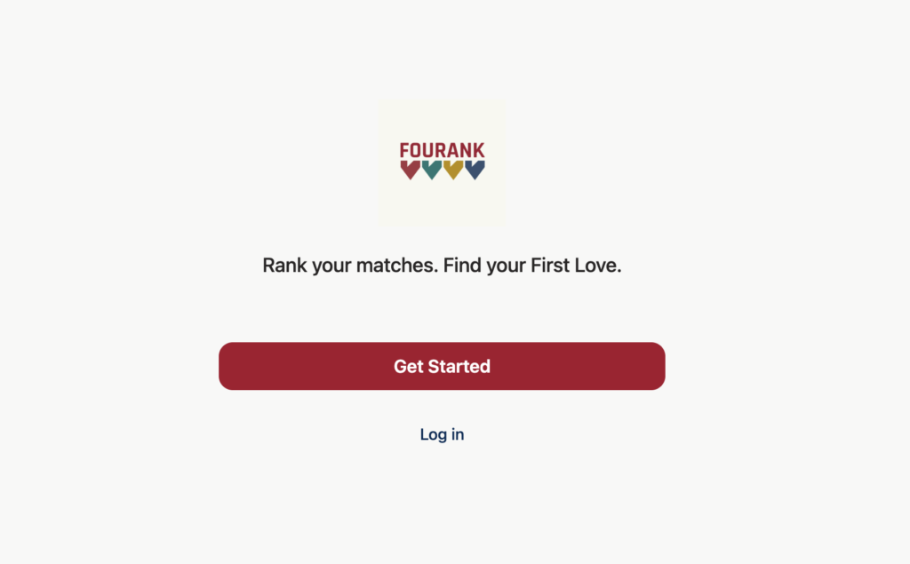
The Fourank Concept
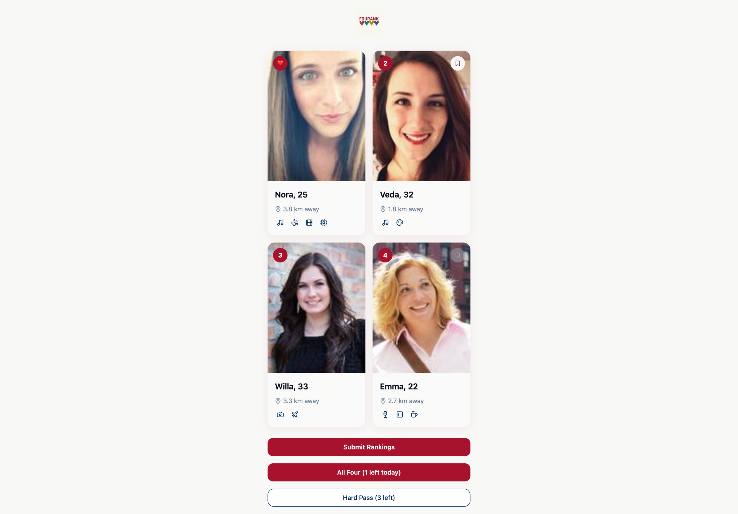
What if instead of swiping through an endless stream, you saw a small set of profiles at once and had to rank them?
The core idea was simple: show users four profiles simultaneously, and ask them to rank those four in order of preference. First, second, third, fourth. That’s it. A single decision. But a decision that requires actual thought.
The name came from the mechanics. Four options. Ranking behaviour. Fourank.
The hypothesis was that this constraint would change the user experience in useful ways. If you only see four profiles at a time, you have to look at each one carefully. If you have to rank them, you can’t avoid the decision. You can’t swipe past someone without making a judgement about them relative to the others. That friction might actually create better decision-making.
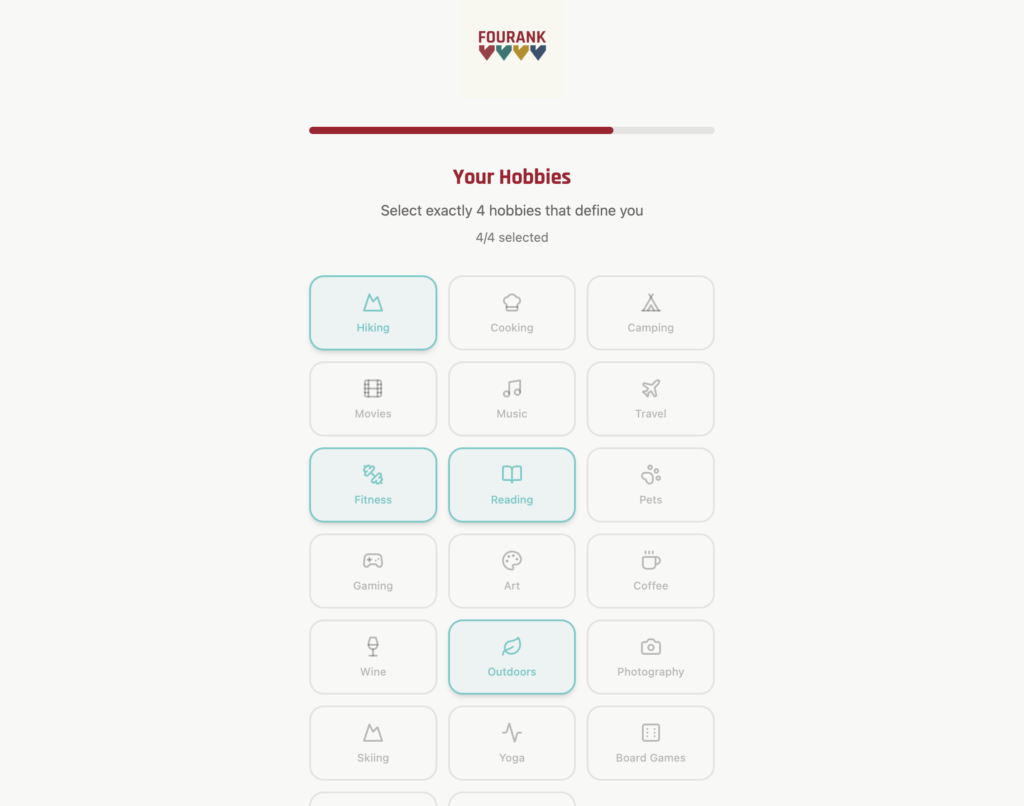
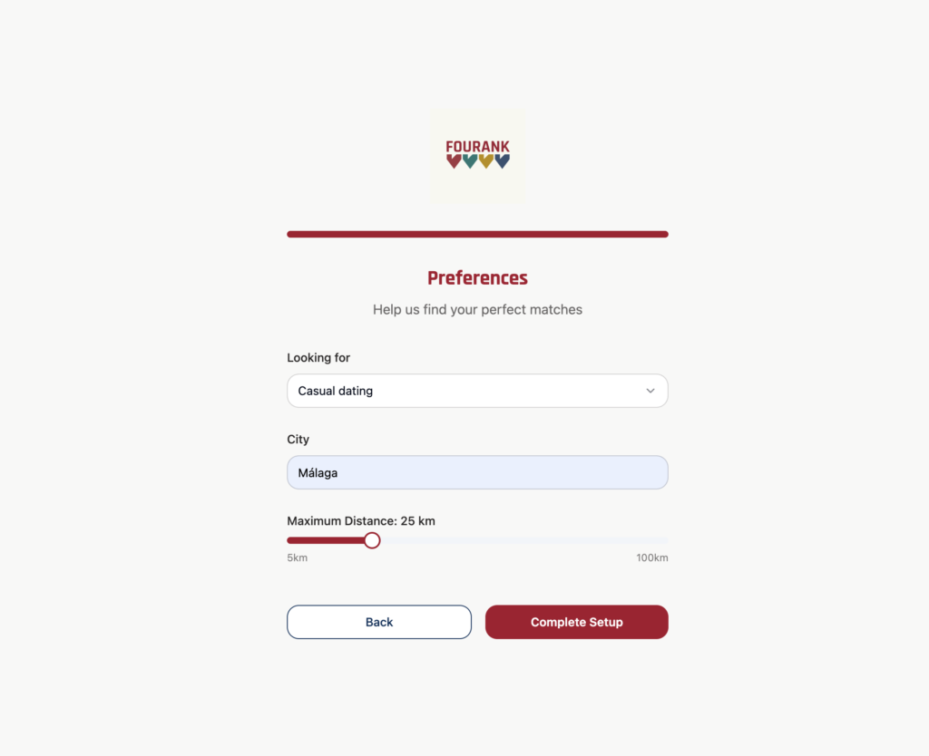
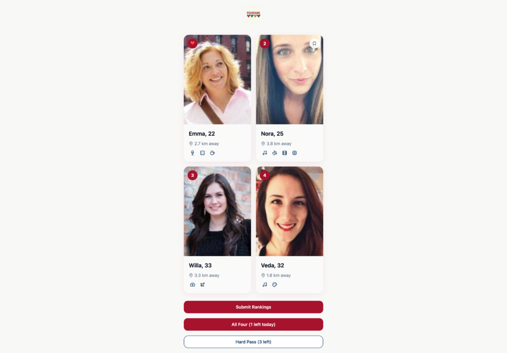
How the App Would Work
The discovery mode would show four profiles in a 2×2 grid. Each card would display a name, age, and distance. You could tap and hold on a profile to open a modal with their full photo set, written prompts, and interests. Then you’d drag and drop the four tiles to rank them from 1 to 4. The number one rank was the “like” equivalent, akin to a right swipe on Tinder.
Once ranked and submitted, the number one profile would be permanently liked. It wouldn’t appear again. Profiles you didn’t save would disappear forever. But you could save up to five profiles per day from the second, third, and fourth positions. There was a hierarchy: you could only save a fourth choice if you’d saved the second and third. This created a cascading intentionality about which profiles were truly worth keeping.
The app would have a “First Love Match” feature. If you ranked someone as number one and they also ranked you as number one, the app would trigger a special celebration. Both of you would be notified. A match that actually meant something.
You’d also have a “hard pass” button to skip an entire stack of four profiles, but only three times per day. This constraint kept behaviour mindful rather than automated.
Over time, the app would learn your preferences based on these rankings. The system would notice patterns. Who do you rank first most often? What age range, what interests, what locations. The algorithm would use that data to serve you more relevant profiles. Unlike the infinite scroll, where relevance is secondary to engagement, Fourank’s entire point was relevance.
The Business Model
I sketched out a monetisation strategy:
Daily save limits of five could be increased through in-app purchases. Five extra saves would cost £2.29, whilst twenty would cost £7.49. Alternatively, there was a “photo rating mode” where users could gamify rating other people’s photos and earn save credits.
Hard pass boosts (three additional skips per day) would cost £1.49.
A premium feature called “First Love Reveal” would show you if someone almost ranked you number one for £3.74 per month or bundled into a premium plan.
There was also the possibility of profile boosting. You could pay to have your profile shown higher in other people’s stacks, giving you more visibility.
And finally, cosmetic unlocks. Users could change heart colours, animations, and backgrounds for £1.49 to £3.74.
Fourank Monetisation Strategy
Five revenue streams designed to reward engagement
Revenue Tiers
Fourank uses a freemium model with optional paid upgrades. Users can access the core experience (discovery, ranking, matching) for free, but can unlock enhanced features for small, one-off or recurring payments.
Pricing Philosophy
Prices are intentionally low to reduce friction. The goal isn’t to extract maximum revenue per user, but to offer small quality-of-life improvements that enhance the experience. Users who spend money feel they’re getting good value, and the business sustains itself through volume and a growing user base.
Strategic Approach
Effort-based earnings: Users can earn save credits by participating in the photo rating game, making the system feel rewarding rather than purely transactional.
Psychological nudges: Daily limits (5 saves, 3 skips) create natural pressure points where users consider upgrading rather than waiting.
Premium insights: First Love Reveal taps into the human desire to know if they’ve impressed someone, a powerful motivator in dating contexts.
Visibility plays: Profile boosting targets ambitious users who want more matches and are willing to pay for prominence.
Cosmetics for expression: Low-cost visual unlocks appeal to users who want to personalise their experience without affecting core gameplay.
The Branding
I spent time on the visual identity. The wordmark would be “FOURANK” in Rajdhani font. The colour palette was deliberate: a bold deep red (number one primary CTA), gold accents for rewards, navy blue for secondary CTAs, light teal for interactive touches, creamy grey for light backgrounds, charcoal for dark mode.
The design principles were clarity over clutter, decisions over swipes, earning rather than scrolling, constraints creating focus, and design with delight. The tagline was “Rank your heart out” or “Not just swipe, decide” or “Only 4. Choose wisely.”
Building the First Version
I started prototyping in the summer of 2025. I wanted to move fast, so I used a tool called Lovable. If you haven’t heard of it, Lovable is an AI-powered builder that lets you describe what you want and it generates a working application. It’s not no-code exactly, because you can see and edit the code. But it’s close.
Lovable worked well for getting something functional quickly. I set up authentication using Supabase. I built the profile system. I created the photo upload mechanism. I got the ranking interface working. Within a few weeks, I had something that looked like a real dating app.
But Lovable has significant limitations, and they became clear once I needed to debug and refine.
The Lovable Problem
Lovable is good for getting from zero to something. But once you’re past that initial phase, you hit walls. The configuration is hidden. When something breaks, the error messages are cryptic. You can’t easily see what’s actually happening under the hood. It’s a black box.
I ran into several issues. Photo uploads would fail mysteriously. The authentication system would throw “Failed to fetch” errors that could mean anything. The data wasn’t flowing correctly between the frontend and backend. I’d spend hours trying to debug something, only to realise I couldn’t actually see the configuration that Lovable had set up.
This is the trade-off with these tools. They’re fast initially. But they create a glass ceiling. You can see your app working, but you can’t really understand why or fix it when it breaks.
Supabase and Its Own Problems
I used Supabase as the backend. Supabase is excellent, actually. It’s a managed PostgreSQL database with built-in authentication, storage, and APIs. The tooling is solid. The documentation is good.
But I ran into a specific frustration: the free tier has project pausing. If your project is inactive for a certain period, Supabase pauses it. Then you have to manually reactivate it. This was tedious. Every few weeks, I’d try to test something, only to find the project paused. It was a minor inconvenience that added up over time.
Beyond that, I made a security mistake early on. I configured the database with overly open row-level security policies. Profiles were publicly readable. That means anyone with the database URL could access user data, including names, dates of birth, locations, and preferences. That’s a serious privacy issue. I corrected it, but it was a useful reminder that security is not something you patch in later. It has to be designed in from the start.
The Design Decision I Regret
Looking back, I’m not entirely convinced the ranking mechanic was the right choice.
The theory was sound. You need deliberation. You can’t avoid making a choice. You’re forced to compare people explicitly.
But in practice, the interaction is a bit clunky. To rank four profiles, you’re dragging tiles around or tapping numbers to sort them. Then you submit. It’s not as smooth as swiping. It requires more deliberate action.
And here’s the thing: there’s a reason Tinder’s swipe mechanic is so popular. It’s not just simplicity. It’s that the interaction feels natural. Swiping left and right is intuitive. It’s fast. It doesn’t require you to think about what you’re doing. That last part matters more than I initially gave it credit for.
The more I thought about it, the more I realised that the infinite scroll and the binary choice aren’t flaws in dating apps. They’re features. They remove friction. They let people make quick decisions. They’re addictive because they’re designed to be, yes, but they’re also addictive because they feel good. The interaction design works.
Fourank’s interaction design, by contrast, is more considered but also more effortful. And in a space where the goal is to make it easy for people to explore and find matches, more effortful is not necessarily better.
The Full Technical Stack
At a certain point, I considered rebuilding Fourank from scratch using Claude Code. Claude Code is a terminal-based AI assistant that lets you write and manage code directly. It’s more advanced than tools like Cursor, and the integration with Claude’s capabilities is seamless. I sketched out the architecture. I knew how I’d use Firebase instead of Supabase, how I’d structure the database with Firestore collections, how I’d build the frontend with Next.js and TypeScript.
But I didn’t actually do it.
The more I thought about it, the more I realised that Fourank wasn’t a strong enough concept to warrant a full rebuild. The fundamental problem wasn’t the tools or the architecture. It was the interaction design. And I wasn’t convinced that the ranking mechanic was actually better than the swiping mechanic that already existed.
So I stopped. I had something that worked. I had learned a lot. But I didn’t have something that felt worth pushing forward.
Where It Stands Now
The backend is fully set up. Firebase is connected. The database is secure. Authentication works. The onboarding flow is built and tested.
The discovery interface and ranking system exist but weren’t completed. The matches page exists as a concept but wasn’t implemented.
The project is in a state where it could be finished relatively quickly if I came back to it. All the hard infrastructure work is done. What remains is the UI and the business logic around discovery and matching.
But the honest truth is that… I’m not sure I want to finish it.
What I Learned
This project taught me several things.
First, I learned that my initial hypothesis about ranking being better than swiping was probably wrong. The simplicity and speed of swiping is a feature, not a bug. It works for a reason. Fourank’s added friction doesn’t necessarily lead to better decision-making. It might just make the experience more tedious.
Second, I learned that building with the right tool matters more than building in the right tool. Lovable seemed convenient initially, but it created more problems than it solved. Claude Code was more work upfront, but it gave me control and understanding. If I had to choose, I’d choose control and understanding every time.
Third, I learned that dating apps are a fascinating problem space. Not because I think I can unseat the incumbents. The network effects are too strong, and the user habits are too established. But because the space forces you to think about things like preference, compatibility, intentionality, and how to create good experiences within the constraints of a digital interface.
Fourth, I learned that having an idea is nothing. Executing on the idea is what matters. And even with good execution, you might still arrive at the conclusion that your original idea wasn’t actually better than what already exists.
Why I Built It Anyway
All of that said, I’m glad I built Fourank.
Not because I think it’s going to become a billion-pound company. Not because I’m planning to launch it and disrupt the dating app market. But because the exercise of building it forced me to think carefully about a real problem. It forced me to make decisions. It forced me to learn about Firebase, about authentication, about database design, about security rules, about user onboarding flows.
And it was genuinely fun to think about whether there was a different way to approach dating. Even if my answer ended up being “no, the existing approaches are pretty good.”
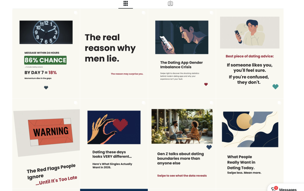
I also started SwipeStats as a companion project. The idea was that before launching Fourank, I’d build an audience by creating educational content about dating apps and dating behaviour. SwipeStats would explain patterns and insights. Then when Fourank was ready, I’d have an existing community to share it with.
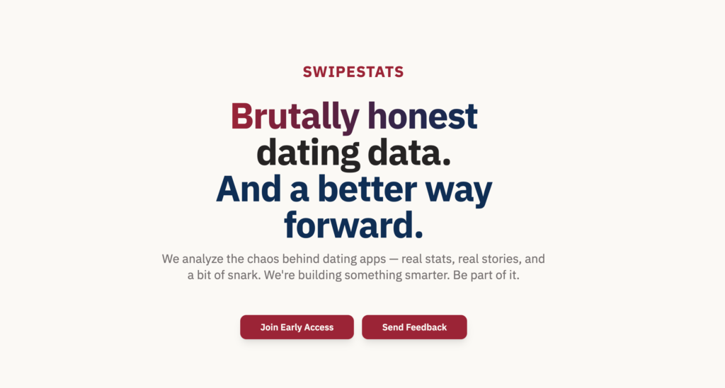
SwipeStats was its own interesting exercise in content creation and brand building. But that’s a separate story.
Reflections
Dating apps work well because they solved a real problem. They made meeting people easier. The interfaces are standardised because that standardisation is intuitive and effective. Tinder’s swipe mechanic became the default because it actually feels good to use.
That doesn’t mean there’s no room for experimentation. But it does mean that if you’re going to do something different, it has to be different in a way that’s actually better, not just different for its own sake.
I’m not convinced Fourank was better. I think it was interesting. I think it was worth exploring. But I think the reason Tinder, Bumble, and Hinge are the dominant players is because they got the interaction design right. And that matters more than I initially gave it credit for.
Would I do it again? Probably not exactly like this. But I’d definitely build something again. There’s something powerful about taking an existing product category and asking “what if we did it differently?” Even if the answer is “what they’re already doing is pretty good.”
I had a lot of fun ‘testing’ the dating app market in the process though.
Swipe right?
Anyway… if you’ve read this and you think I’d make a good match for your company or for a project, get in touch!